Building a High-Conversion Landing Page: 9 Reasons My Landing Pages Convert at 47% (When the Average Is 4.02%)
Ready to dial your online marketing success rate to 11? This post from Andrew Smith, Channel Mastered’s Digital Marketing Strategist, offers proven, practical, repeatable advice.
When dealing with niche audiences, every click matters. But in the tech-heavy domain of IT, the human touch can feel as rare as a glitch-free product launch. No matter how technical the industry is, humans are emotionally driven creatures, and if we cannot connect to this part of the brain, it spells certain failure in converting new leads.
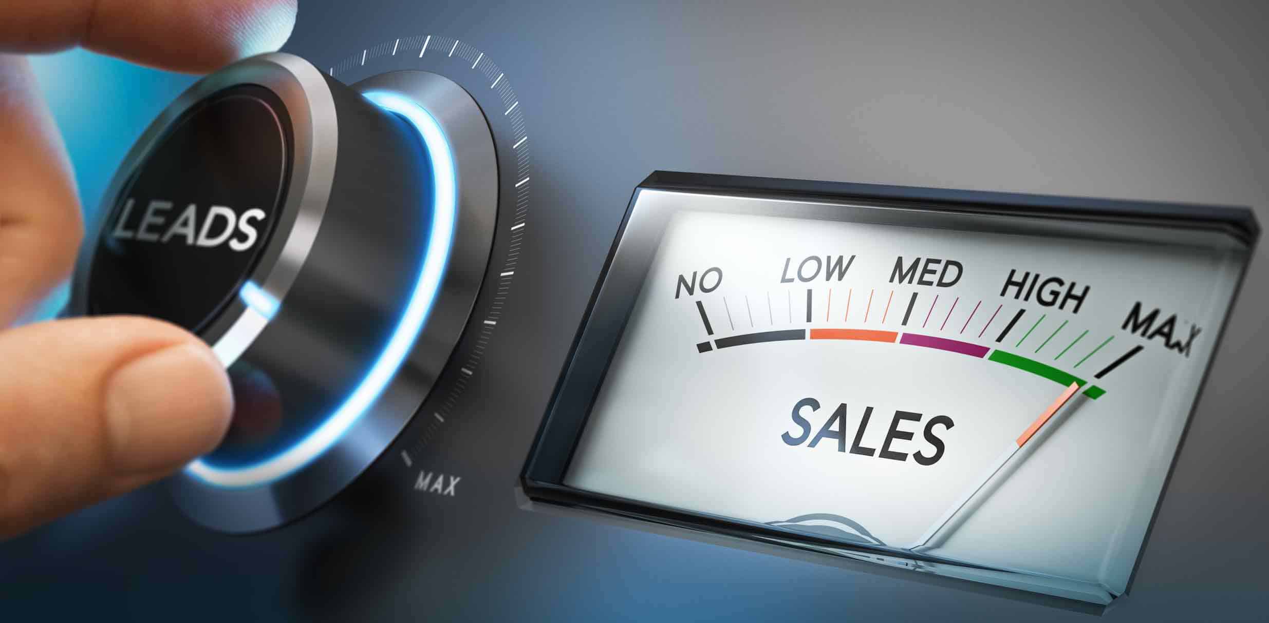
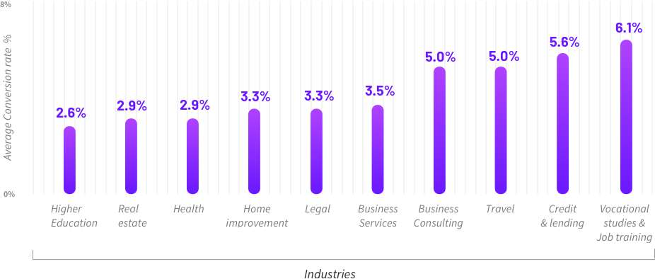
Unbounce, an incredibly popular landing page software maker, analyzed millions of visits across its sites and found that the average landing page conversion rate is 4.02% [source]
Yet some landing pages that I’m currently running cold traffic to from Facebook are converting at closer to 47% (and users have to fill out 28 form fields to get the offer!)
The factors listed below make the difference between blowing hundreds of thousands of dollars per year and generating that much or more in revenue. Let’s take a closer examination of the keys to a high-converting landing page.
1. Craft a Compelling Offer
The offer is the heart of your landing page. If it’s weak, nothing else matters. Think about what makes your service unique for IT channel partners and vendors. What problem are you solving? What pain point are you easing? What can you give away for free, even at a loss? A compelling offer should be crystal clear, provide overwhelming benefits, and create urgency. The user must win by a landslide in the trade for their information. For a deep dive into crafting the perfect lead-gen offer, explore 7 game-changing principals of a compelling offer.
2. Capture Attention Immediately
In the fast-paced world of technology, eight seconds can feel like a lifetime. Your landing page must resonate instantly. A user must know what you’re offering, why it matters, and what to do next within those crucial eight seconds. It’s all about being direct and razor-focused. Residential Design Magazine’s landing page illustrates this with a powerful headline and immediate call to action (CTA) to join their community. This has resulted in a 46.7% conversion rate with over 9,995 new subscribers coming from Facebook ads.

3. Single, Clear Call to Action
A single CTA is a golden rule. It guides your visitors exactly where you want them to go. Amazon’s success with the “Buy Now” button is a well-studied example. If every button leads to the same place, they should echo the same message. Mixing “Contact us,” “Download now,” and “Learn more” reduces each other’s effectiveness. Every additional CTA dilutes the original by 50% and increases the amount of choices by 100% — and we do not want option paralysis. Simplify, focus, and watch the conversion rate rise.
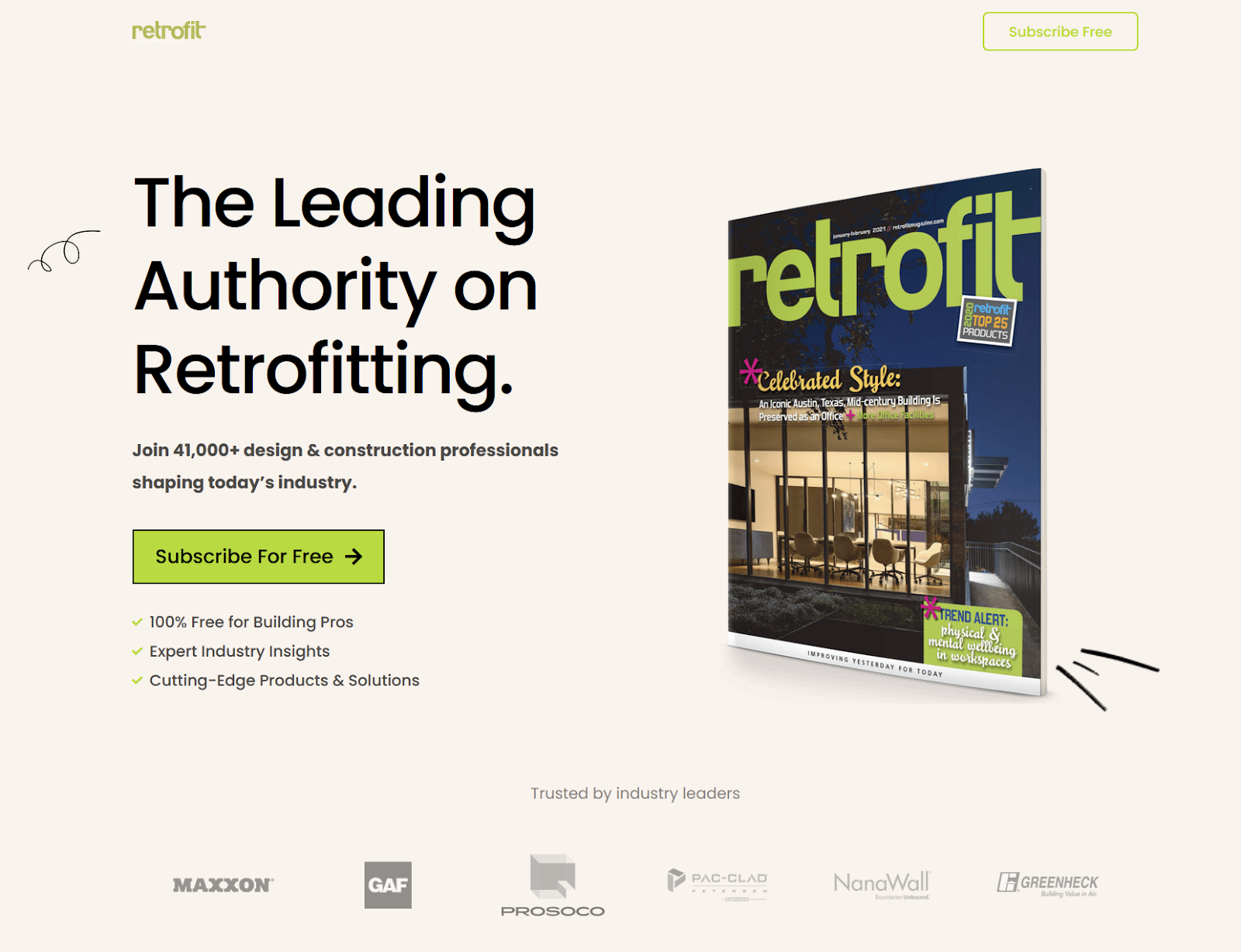
Retrofit Magazine’s subscription page boasts a 43.7% conversion rate with over 1,000 subscriptions in a two-month period. There is nothing to do on the page except “Subscribe Free”. No menu, no social links, just the action they want visitors to take.
4. Speak Benefits, Not Specs
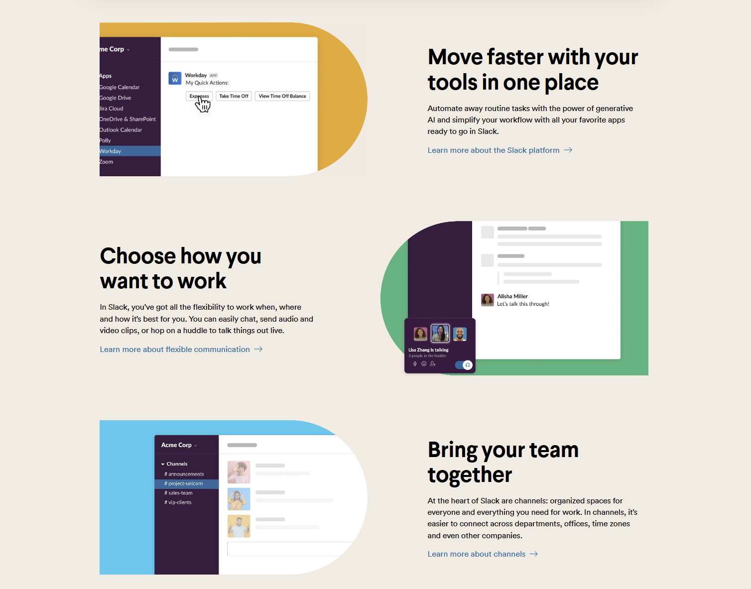
For IT companies, the temptation to dive into tech specs is significant. However, your clients care about benefits. Slack’s user-focused emphasis on reduced email clutter is a guiding light. Talk in terms of time saved, stress reduced, revenue increased. Make the benefits tangible, human, and relatable, and you will woo your visitors into becoming clients.
5. Eliminate All Distractions
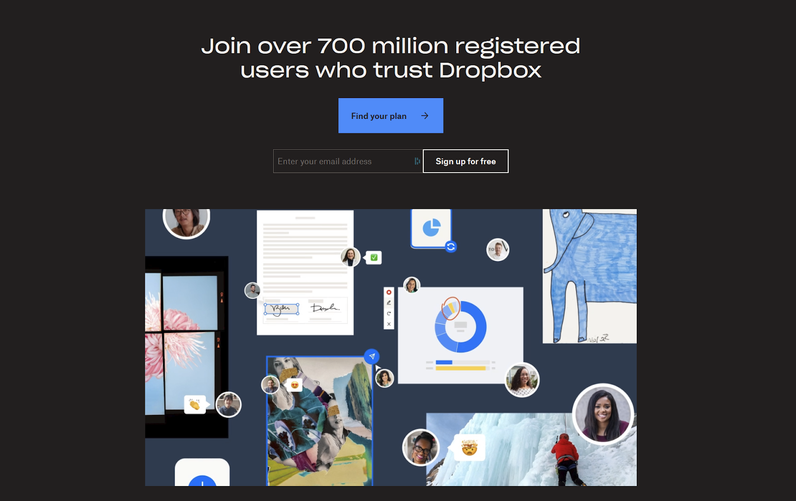
Distractions dilute your message. Remove sidebars, menus, unnecessary pop-ups, and employ .png images for a clean look. Your focus should be laser-sharp, directing visitors to your CTA and nothing else. Look at how Dropbox’s clean and minimalist design eliminates distractions, funneling attention to the primary CTA. There is nothing else to do at the top of the page other than compare plans or enter your email.
6. When in Doubt, Delete
Less often equates to more in landing page design. Apple’s elegant, minimalist approach is a masterclass in this principle. Write out all benefits and distill them down to 2-3 essential points. Keep everything on the page about these points. Less clutter equals more clarity, and that means conversions.

7. Use Visual Cues
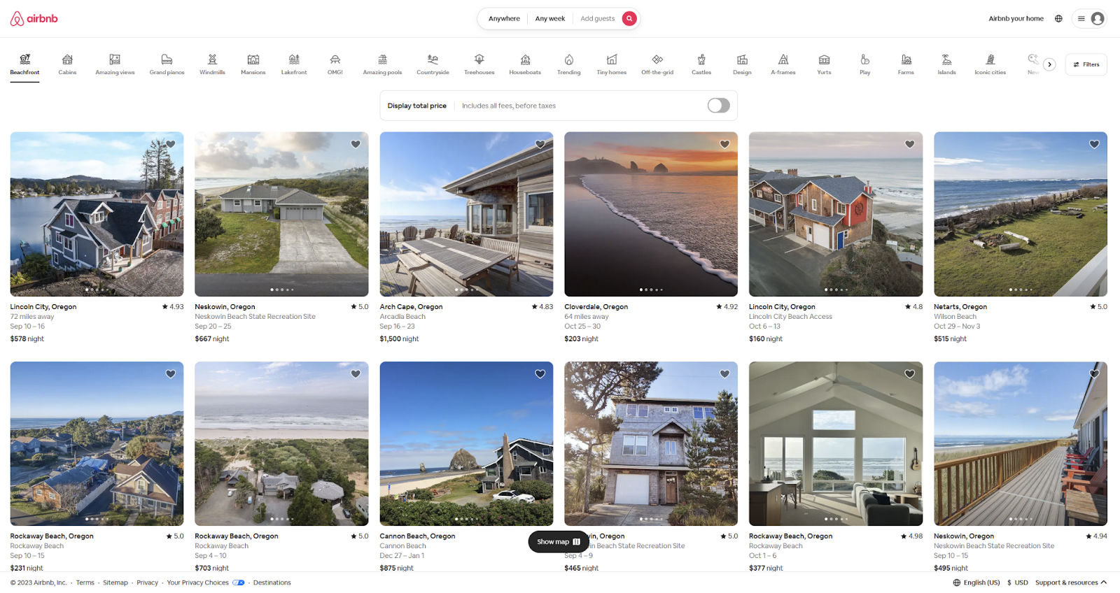
Guide the eye where you want it to go. Arrows, animations, even creative copy can do the job. Utilize visual indicators that draw attention downward and highlight your CTAs with bold, contrasting colors. It’s all about visual flow. Airbnb takes a radical approach that gets visitors to use their product within seconds. People immediately begin scrolling, using their own imagination to envision where they’d like to visit.
8. Real Social Proof
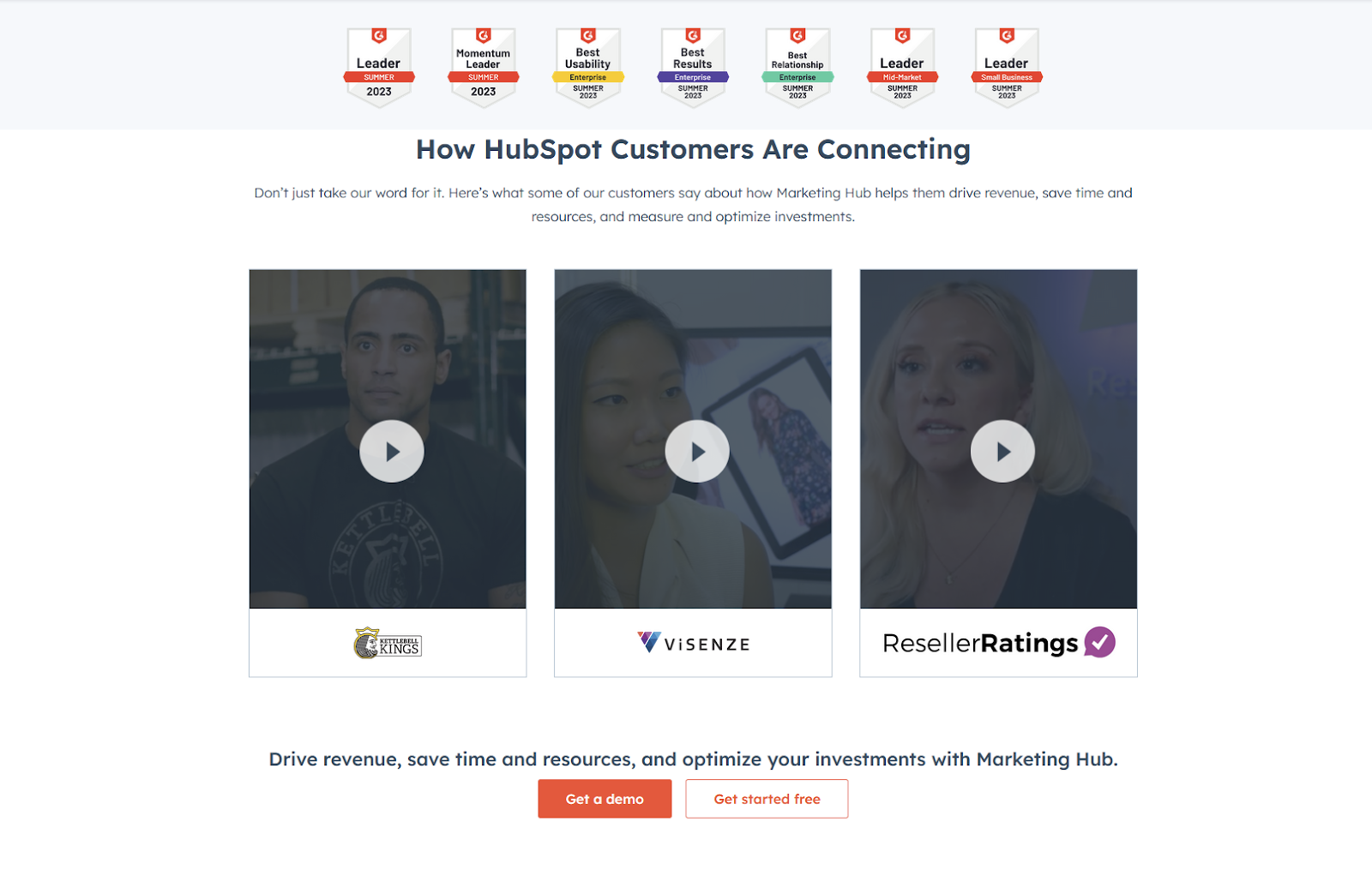
Trust matters, and real testimonials can solidify that trust. HubSpot’s use of authentic client reviews, complete with full names and titles, enhances their landing page’s credibility. Humanize these testimonials with personal details. Avoid generic praise; instead, include real voices of satisfied customers.
9. Ensure Continuity
Your landing page must fulfill the promises made in your ads. A bait-and-switch feel can quickly deter potential clients. Ensure that your message aligns 100% between ads, emails, SEO, and the landing page itself. Create a seamless transition from interest to conversion.

Conclusion
Crafting a high-converting landing page is emotional connection and science intertwined. By focusing on the human aspects, the tangible benefits, and a clear, compelling pathway to action, you can turn strangers into prospects. Embrace these principles and humanize your approach, and the conversions will follow.
Want more tips for building landing pages that deliver? Give us a call at Channel Mastered. We’ve got a million of them.